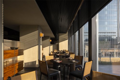
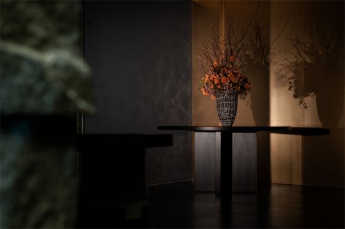
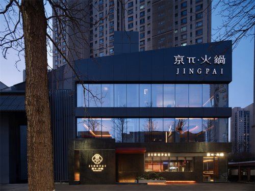
设计团队对漆艺材质的表现形式进行实验性的创作,用大面积漆艺贯连空间,意外的拥有混凝土的质朴,同时也拥有了华丽的视觉。结合地面木地板与收口金属材料的碰撞,软硬的互相推让与和谐,冷暖色彩的交替,收口的细节,深圳餐厅设计表现的是整体产品平和与热闹的和谐,并将热烈、响应、对冲等元素融入空间的建造体系中。
The design team experimented with lacquer art in an innovative way. The large area of lacquer art throughout the entire restaurant unexpectedly retains the simplicity of concrete and meanwhile generates a gorgeous visual effect. The contrast between the wood flooring and metal edging, the harmonious coexistence of hard and soft textures, the alternation of warm and cold colors, as well as the edging details, present a peaceful and lively harmony and integrate various contrasting, resonating elements in the space.


07
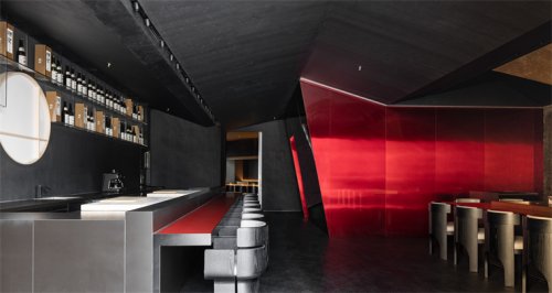
红色记忆| 笑看清浅流年事 纂刻时光镀年华
Red memory | Retrospect the past beautiful memories and depict the future
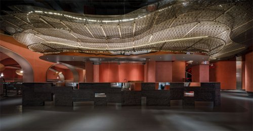
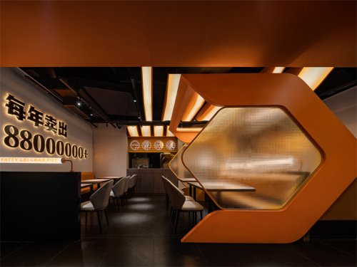
空间整体动线考虑到消费者的消费动机,我们结合空间整体主替功能做了合理性规划,最终呈现结合功能布局做整体响应。「红」是AD艾克建筑设计团队在用西方的设计秩序来建树东方的空间情绪与哲学。餐厅的整体设计语言促进馆区启动转型融入新消费模式生态:深圳餐厅设计提供多媒介多感官体验,在线流量推动线下体验,空间加强消费客群粘性,助力潮菜品牌推广。这也是AD全案策划团队的服务宗旨。
The guests' consumption motivewas a key consideration in the circulation design, so the design team worked out a rational layout based on the main and auxiliary functions of the overall space. AD ARCHITECTURE used Western design order to build Eastern spatial sentiments and philosophy in the restaurant space. The overall design language of the restaurant introduces a new consumption mode into the library area to drive its operational transformation. The restaurant offers a multi-media and multi-sensory experience and improves the offline experience through online media promotion. The space design aims to increase consumer stickiness and promote the Chao cuisine brand, which is exactly the objective of AD ARCHITECTURE in this project.


更多深圳餐厅设计请关注聚设汇装修平台: