项目名称:R.JIE买手店设计
Project Name: R.JIE
项目地址:无锡市万象城
Location:Wuxi, China
设计单位:无锡欧阳跳建筑设计有限公司
Design Company: OYTT Design
主案设计师:欧阳跳
Chief Designer:Tiao Ouyang
辅助设计师:郭芷萌、周丹凤
Assistant Designer:Zhimeng Guo, Danfeng Zhou
项目面积:70平米
Area: 70 square meters
设计起止日期:2021年2月
Design Cycle: February 2021
完工时间:2021年5月
Completion Time: May, 2021
主要材料:微水泥、砖、艺术涂料
Main Materials: Microcement, brick, art paint
业主名称:Emma
Client Name: Emma
灯光:米未照明
Light:Miwei Lighting
项目摄影:陈铭
Photographer:Ming Chen
随着“让专业的人去做专业的事”这一理念深入人心,“买手店”这一集各家之大成的新兴业态开始崛起。买手店设计凭借着“Fashion buyers”灵敏的时尚嗅觉和超前审美,在众多潮流精品中进一步去粗取精,将最具时尚价值的热门单品汇集一域。
With the concept of "let professional people do professional things" deeply rooted in the hearts of the people, the emerging business form of "buyer shop" has begun to rise. With the sensitive fashion sense and advanced aesthetics of "Fashion buyers",it can further refine among many fashion boutiques, bringing together the most fashionable hot items.
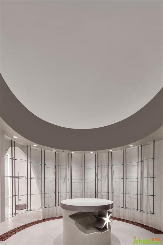
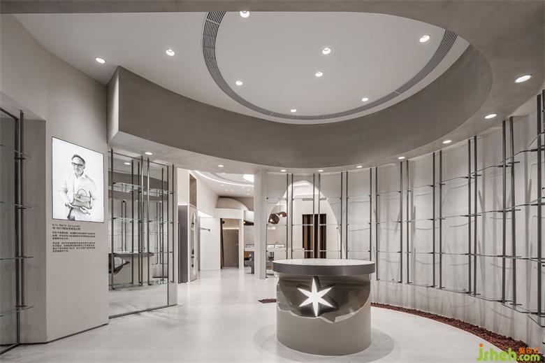
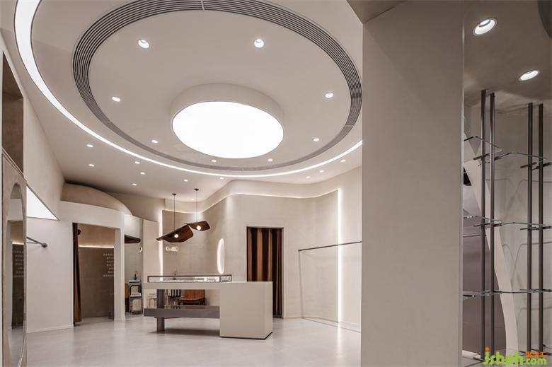
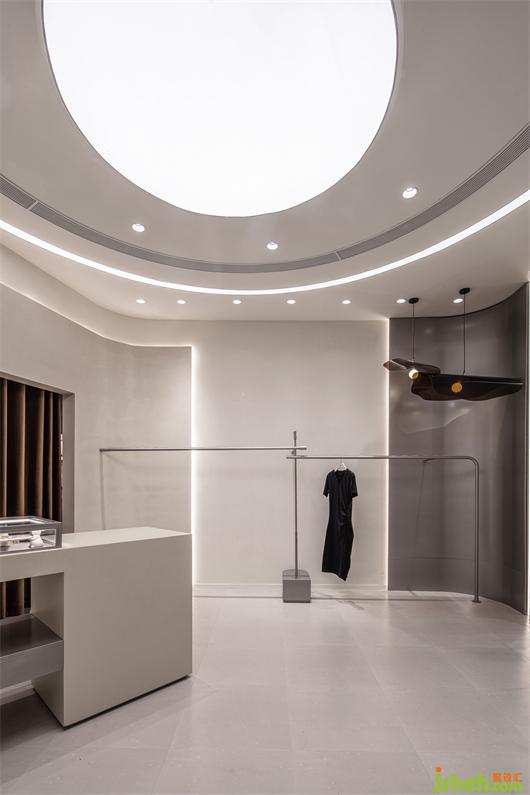
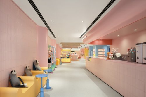
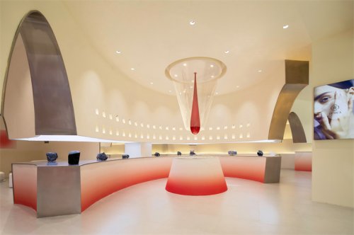
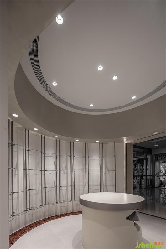
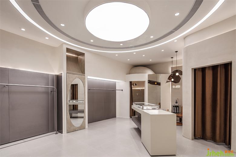
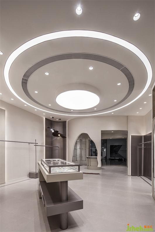
一个有设计智慧的店面如同一盏独运匠心的容器,既要其自身独具创意、内蕴丰富;也要顺应商品肌理,将“衬托作用”拉满,不自行其是,也不喧宾夺主。R.JIE买手店项目深度剖白了主理人的选择逻辑,买手店设计团队充分深挖品牌的调性和追求,所有展示台均为极简风格,能够最大程度将商品的颜色与质感、风格与气质衬托出来,将一次发掘探索式的消费体验呈现给到访的客人。
A store with design wisdom is like a container of originality, which should be unique and rich in connotation. It should also comply with the texture of goods, play full role of the "foil effect", and do not go its own way or dominate others. R. JIE Buyer Shop has deeply clarified the selection logic of the manager. The design team has fully explored the tonality and pursuit of the brand. All display stands are of minimalist style, which can set off the color and texture, style and temperament of the goods to the greatest extent, and present an exploratory consumption experience to the visiting guests.
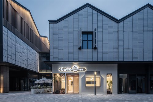
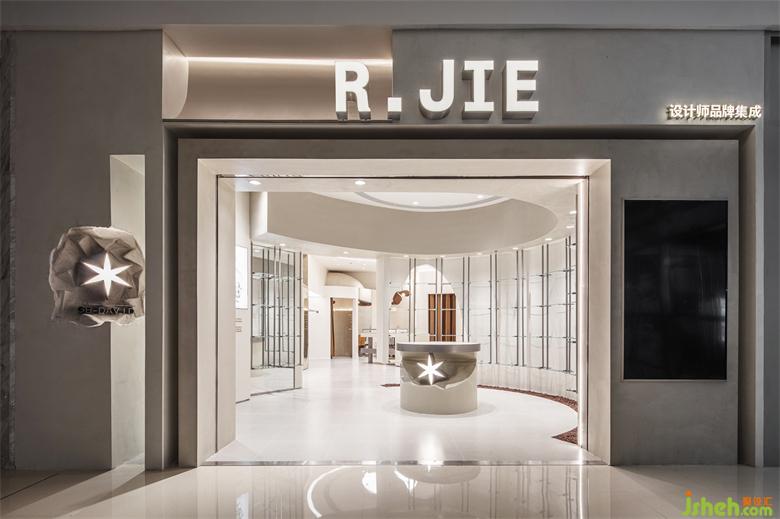
“橱窗就是主理人的杂志封面”,不同于传统品牌的设计理念,买手店门头的设计即是品牌主理人与消费者的首次精神对话。设计团队独辟蹊径,选择了大开距的门面,选色上利用深灰与米白的色彩碰撞,将入口打造成“橱窗中的世界”,主展区的陈列品在外即可一览无遗,同时又彰显了品牌独领风尚的态度和品位。
"The window is the magazine cover of the manager", which is different from the design concept of traditional brands. The design of the buyer shop front door is the first spiritual dialogue between the brand manager and consumers. The design team found a unique way, chose the facade with large opening distance, and made use of the color collision of dark gray and rice white to build the entrance into a "world in the window". The exhibits in the main exhibition area can be seen at a glance, while highlighting the attitude and taste of the brand's unique fashion.